Technical Analysis Figures: Patterns & Examples
Technical analysis figures in trading: basic technical analysis figures with images and examples of use
Technical analysis figures are trading patterns that are repeated over and over again and allow the trader to predict further price movements. In most cases, technical analysis models can simply be found on the price chart, without any additional tools.
Of course, all technical analysis figures can (and should) be confirmed by support and resistance levels, trend lines, trading indicators, etc., and this tells us that all figures have a serious basis and many years of experience of traders. All we have to do is learn to find these repeating patterns on the chart and learn how to use them to make our profits.
Let's figure it out. The flag is formed in wave-like trend price movements, namely during pullbacks against the trend. The correct flag (the one that is formed according to all the rules of technical analysis) consists of three parts:
The flag itself can consist of a couple of candles, as well as complex and lengthy rollbacks against the trend. Typically, traders determine the upper and lower borders of the flag, but use only one border - the breakdown of which will continue the trending price movement, so the second border is auxiliary and serves solely to visually determine the flag.
For an uptrend, we will only be interested in the upper border of the flag, and for a bearish trend, only the lower border. A breakdown of these boundaries indicates the end of the rollback and the continuation of the trend. It is after the border is broken that it is worth opening a deal for 3-5 candles. The time frame can be any - from M1 to W1 (weekly time frame).
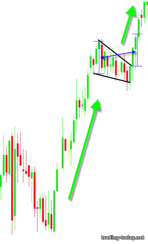
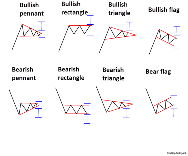
Let's look at the Flag technical analysis figure in practice. For an uptrend, the flag will look like this: For a flag to work best, the flagpole must consist of a good trending price movement, preferably without small pullbacks. In a downtrend, the Flag pattern will look like this: To better identify the pattern, during a rollback it is better to wait for a slight price fluctuation in the direction of the trend and set the main border of the flag based on this fluctuation - this will allow you to avoid mistakes when forming complex rollbacks. The flag itself will always be directed against the trend, but signals from it will always be in the direction of the current trend.
A pennant in a bullish trend looks like this: For a bearish trend the situation is completely opposite: As in the case of the “Flag”, the Pennant is formed after strong trend impulses - these impulses are called “Flagstaff” or “Pole”. It is imperative to take into account the updating of peaks or troughs - i.e. A pennant can only be viewed in trending price movements.
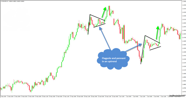
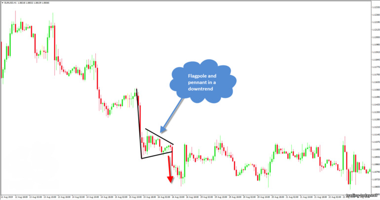
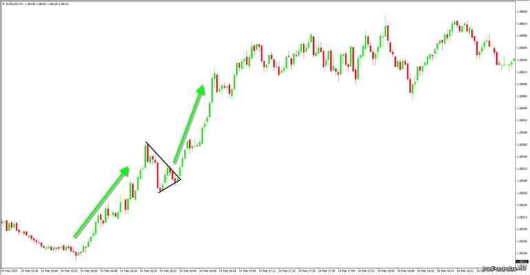
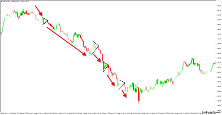
If we look at the pennant on a real chart, then in an uptrend it will look like this: In a bearish trend (downtrend), the pennant will look like this: It is not uncommon for traders to first trade the “Flag” technical analysis figure, and then trade the “Pennant”. This is due to the fact that during price formation it is not entirely clear what kind of pattern is being formed. The flag is formed many times faster than a pennant, but since... Both of these figures have the same data and differ only in shape, then no one will forbid you to receive double profit.
If we compare the “Flag” figure and the “Pennant” figure, we get the following:
A double top occurs after bullish trends at the very top. Several variants of the “Double Top” can be considered:
The lowest point located between the two peaks is called the "neck" or "neck level". Accordingly, the distance from the neck level to the second top is the approximate distance that the price will travel after the pattern is triggered and the trend changes to a downward one. If we look at the “double top” technical analysis model on the price chart, it will look like this: The best point to open a trade will be the moment the “neck line” is broken, but do not forget that this is also a zone (support zone), so there are two options for opening a trade:
All other formation conditions are exactly the same as for the “double top”. A double bottom is formed as follows:
If we consider this model of technical analysis in more detail, we get the following:
The head and shoulders pattern literally shows us the transition from an uptrend to a downtrend. A trade is entered when the neck line is broken - the line indicating the lowest point of retracement after the formation of the left or right shoulder begins. Everything here is the same as with the “double top” model - you can open a deal when the level is broken, or you can wait until the breakout candle closes and only then enter the market for sure.
On the price chart, the “Head and Shoulders” technical analysis model will look like this: The height of the Head and Shoulders technical analysis pattern will indicate the distance that the price is likely to travel in a downtrend after the reversal pattern has fully formed.
As in the previous case, “Reverse Head and Shoulders” consists of three depressions:
The figure highlights the section of the chart where the downtrend changes to an uptrend - this is the bowl. The change in trend can be traced by the troughs and peaks - the troughs stop updating, and the peaks, on the contrary, begin to update each other. The first price rollback in an emerging uptrend acts as a handle - confirmation that the downtrend is over and bulls are now ruling the market. The upper “borders” of the bowl are located at the level of support and resistance, but we will be interested only in the left border, because a breakdown of this border will mean the continuation of the trend.
Traders also very often open on a breakout of the “handle” - a price rollback against an upward trend movement. Here the conditions for entry are exactly the same as when trading the “Flag” or “Pennant” patterns - the upper limit of the set rollback channel is broken - we open a trade up. The bottom of the “bowl” can look like a depression or a consolidation (our example). It is important that the uptrend that has begun is visible, during which a pullback has formed - the handle of the bowl.
As in the usual “Bowl with a Handle” technical analysis model, the edges of the bowl will be at the level of support and resistance, but we will be interested only in the left part of the “bowl” and the handle, which will also be formed on the left.
The trading conditions for this model are similar to the previous one - transactions can be opened when the horizontal line of the “bowl” is broken, and you can also trade “Flag” or “Pennant” during the formation of the “handle”: Here, the change in trend can be seen by the peaks: the updating of the peaks stopped at the “bottom of the bowl”, but the troughs began to be updated - a clear sign of the emergence of a downward trend.
A rectangle does not always indicate the complete end of a trend. On the contrary, having formed in a trend, the rectangle indicates a strong zone of supply and demand, which the price is not able to break through in the near future, but as soon as market participants have enough strength, the trend will continue. The upper and lower boundaries of the rectangle are formed by support and resistance zones (demand and supply zones).
When it comes to using rectangles in trading, there are only three reliable methods:
It would be more correct to look for entry points in the bearish rectangle:
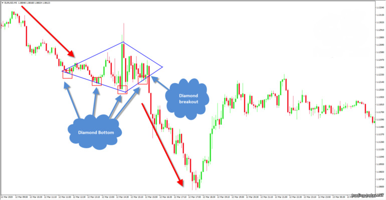
The model itself is a rhombus, and if the figure is formed in an upward trend, then only the upper edges of the diamond are important to us, and if the trend was downward, only the lower edges of the diamond are important. Simply put, we need to determine the breakout points - these are our points for entering the trade.
In an uptrend, the top edges of the diamond are determined by the tops. The upper left edge of the diamond is drawn through at least two peaks, and the right edge of the diamond is drawn through the highest (central) and next (right) peak - a breakdown of this particular edge will tell us about the continuation of the trend. The lower edges of the diamond are additional and do not carry any important information, except that they indicate the boundaries of the narrowing channel: If we consider a diamond in a downward trend, then the lower edges line up along the depressions. In a correct diamond, there must be a depression that stands out, indicating a local minimum, and on the right and left there are depressions that formed a little higher. A breakout of the lower left edge shows us the entry point and informs us about the continuation of the trend:
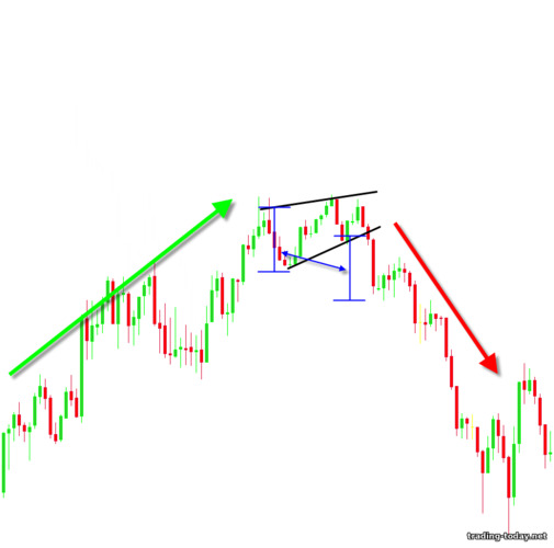
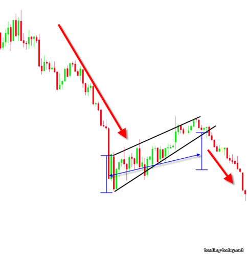
A growing wedge is a tapering triangle pointing upward. If a rising wedge forms at the top of a trend, then it is a reversal pattern and we should expect a bearish price movement: If a growing wedge formed during a downward or bearish trend, then such a pattern is a “rollback”, which means we should expect the trend to continue: The boundaries of the rising wedge indicate weakness of the bulls, which means that the lower boundary will soon be broken. The distance of the base of the wedge indicates the likely distance that price will travel after exiting the wedge, so you can always evaluate the situation and decide whether the play is worth the candle or whether you should wait for a better opportunity.
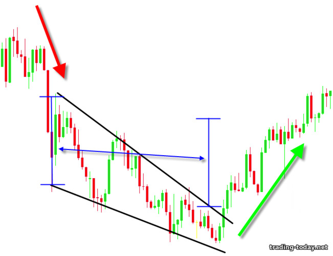
The width of the base of the falling wedge will indicate the distance that the price will cover after breaking the upper border. Unlike a rising wedge, in a falling wedge we should expect a breakdown of the upper boundary. In a downtrend, a falling wedge looks like this: If we consider a falling wedge in an uptrend, it will be a trend continuation figure:
In trend movements, triangles very often serve as trend continuation models, indicating areas of the chart where market participants are gaining strength before the next strong push. For example, in an uptrend, the triangle might look like this: In a downtrend, the triangle will look like this: As with the “Flag” model, we will be interested in only the side of the triangle that is directed towards the current trend - a breakdown of this border means the continuation of the trend. The height of the base of the triangle will indicate the minimum distance that the price will travel after exiting the triangle.
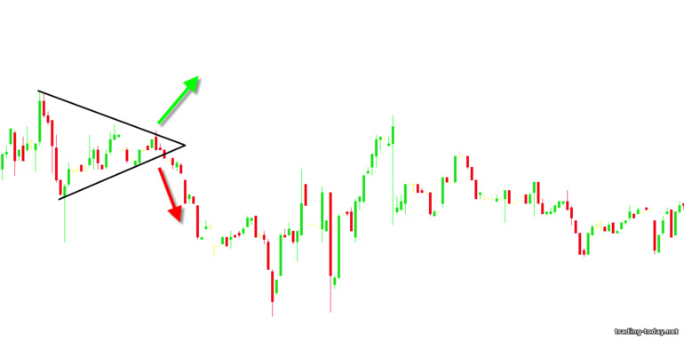
If a symmetrical triangle has formed after a sideways price movement, then it is very difficult to guess where exactly the price will go - a balance has been established in the market between bulls and bears, and the price can go both up and down. In such cases, it is best to just wait - the triangle will gradually compress the price and, sooner or later, it will break through one of the boundaries. In our example, the price went down, breaking through the lower border - the entry point, I think, is obvious:
It is worth noting that triangles, like any other technical analysis figures, do not provide a 100% guarantee that the model will work as intended. For example, there are cases when, after the appearance of a descending triangle, the price broke through the support level and went down. Such cases are rare, but it is still possible. Always remember that there are no 100% trading strategies and do not forget about the risks that accompany a trader throughout his trading journey!
Most of the following figures can also be reversals - it all depends on where these figures are formed. Entry is made exclusively after the formation of the figure and only in the direction of the current trend.
The patterns are repeated - they have been tested over the years and by thousands of traders. No matter what trading method you currently use, technical analysis patterns will not only bring something new to your trading, but will also improve your current trading results.
Of course, all technical analysis figures can (and should) be confirmed by support and resistance levels, trend lines, trading indicators, etc., and this tells us that all figures have a serious basis and many years of experience of traders. All we have to do is learn to find these repeating patterns on the chart and learn how to use them to make our profits.
Contents
- Flag pattern in technical analysis of charts: how to correctly use the flag pattern in trading
- Pennant pattern in technical chart analysis: trend continuation pattern
- Double top (pattern M) – reversal pattern of technical analysis
- Double bottom (W pattern) - a pattern of changing a downtrend to an uptrend
- Head and shoulders – technical analysis reversal pattern for an uptrend
- Reverse head and shoulders - reversal technical analysis pattern for a downtrend
- Bowl with a handle - a trend change pattern in technical chart analysis
- An inverted bowl with a handle - a figure changing an upward trend to a downward trend
- Rectangle is a consolidation (sideways movement) figure in technical analysis
- Rhombus or diamond – trend continuation figure in technical chart analysis
- Rising wedge - a figure of technical analysis
- Falling wedge – trend reversal and continuation pattern
- Triangle pattern in technical analysis of price charts
- Three types of technical chart analysis figures
- Why is it worth studying technical analysis patterns?
Flag pattern in technical analysis of charts: how to correctly use the flag pattern in trading
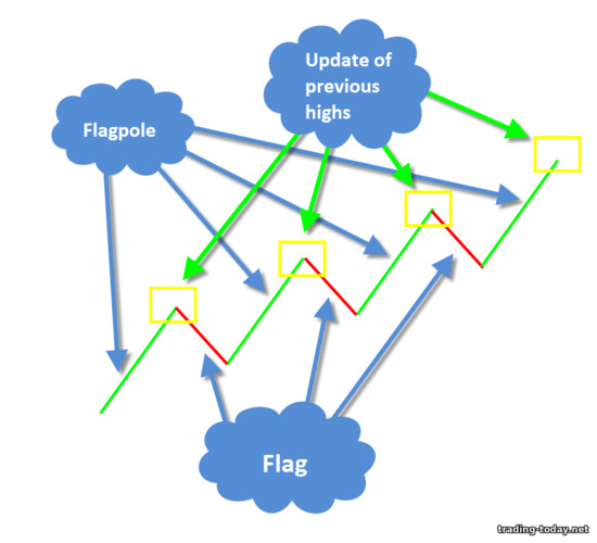
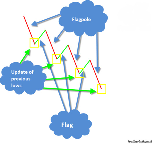
The technical analysis figure "Flag" is a very common and simple figure found in trending price movements and signaling the end of the rollback and the subsequent continuation of the trend. If you know the rules for using the Flag pattern, you can consistently make good profits from trend trading.Let's figure it out. The flag is formed in wave-like trend price movements, namely during pullbacks against the trend. The correct flag (the one that is formed according to all the rules of technical analysis) consists of three parts:
- Strong trend movement - flagpole
- Updating the previous high (for an uptrend) or the previous low (for a downtrend)
- Price rollback – the Flag figure itself
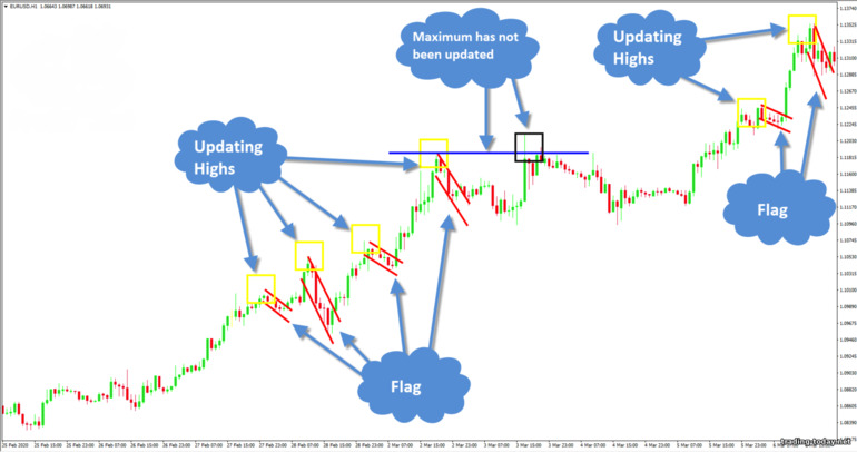
The flag itself can consist of a couple of candles, as well as complex and lengthy rollbacks against the trend. Typically, traders determine the upper and lower borders of the flag, but use only one border - the breakdown of which will continue the trending price movement, so the second border is auxiliary and serves solely to visually determine the flag.
For an uptrend, we will only be interested in the upper border of the flag, and for a bearish trend, only the lower border. A breakdown of these boundaries indicates the end of the rollback and the continuation of the trend. It is after the border is broken that it is worth opening a deal for 3-5 candles. The time frame can be any - from M1 to W1 (weekly time frame).
Let's look at the Flag technical analysis figure in practice. For an uptrend, the flag will look like this: For a flag to work best, the flagpole must consist of a good trending price movement, preferably without small pullbacks. In a downtrend, the Flag pattern will look like this: To better identify the pattern, during a rollback it is better to wait for a slight price fluctuation in the direction of the trend and set the main border of the flag based on this fluctuation - this will allow you to avoid mistakes when forming complex rollbacks. The flag itself will always be directed against the trend, but signals from it will always be in the direction of the current trend.
Pennant pattern in technical chart analysis: trend continuation pattern
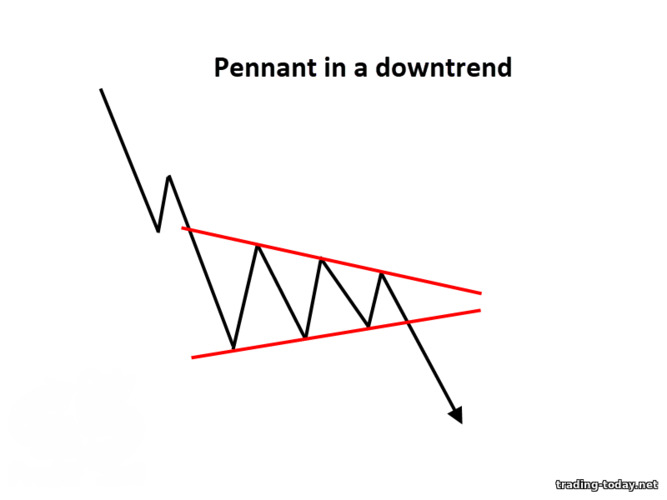
A pennant is a technical chart analysis pattern that indicates the continuation of a trend. It looks like a horizontal triangle, within which price fluctuations gradually fade. A correct pennant leads to a breakout of the upper boundary in an uptrend and the lower boundary in a downtrend.A pennant in a bullish trend looks like this: For a bearish trend the situation is completely opposite: As in the case of the “Flag”, the Pennant is formed after strong trend impulses - these impulses are called “Flagstaff” or “Pole”. It is imperative to take into account the updating of peaks or troughs - i.e. A pennant can only be viewed in trending price movements.
If we look at the pennant on a real chart, then in an uptrend it will look like this: In a bearish trend (downtrend), the pennant will look like this: It is not uncommon for traders to first trade the “Flag” technical analysis figure, and then trade the “Pennant”. This is due to the fact that during price formation it is not entirely clear what kind of pattern is being formed. The flag is formed many times faster than a pennant, but since... Both of these figures have the same data and differ only in shape, then no one will forbid you to receive double profit.
If we compare the “Flag” figure and the “Pennant” figure, we get the following:
- Both figures are formed after the appearance of the “Flagpole” - a strong trend impulse in price
- Both patterns can only be viewed after updating the previous high (in an uptrend) or the previous low (in a downtrend)
- Both figures are trend continuation patterns
- Transactions are opened when the border is broken in the direction of the current trend
Double top (pattern M) – reversal pattern of technical analysis
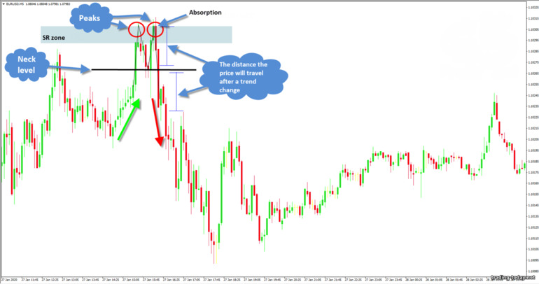
A double top is a technical analysis reversal pattern that indicates the presence of a strong resistance zone that the price cannot break through. After this figure appears, the upward trend changes to a downward trend. There are times when instead of two tops three tops are formed, but, in fact, this is the same pattern, only the bulls tried to break through a strong resistance zone three times.A double top occurs after bullish trends at the very top. Several variants of the “Double Top” can be considered:
- The first top above the second is a strong reversal pattern
- Both peaks at the same price level
- The second top is slightly higher than the first - a weaker, but still working reversal pattern
- The technical analysis model itself will look like the letter “M”
The lowest point located between the two peaks is called the "neck" or "neck level". Accordingly, the distance from the neck level to the second top is the approximate distance that the price will travel after the pattern is triggered and the trend changes to a downward one. If we look at the “double top” technical analysis model on the price chart, it will look like this: The best point to open a trade will be the moment the “neck line” is broken, but do not forget that this is also a zone (support zone), so there are two options for opening a trade:
- The trade is opened immediately after the neck line is broken - a riskier method
- The trade is opened after the candle closes, which has broken through the neckline - the risks are minimal, but it is worth considering that part of the movement may be lost
Double bottom (W pattern) – a pattern of changing a downtrend to an uptrend
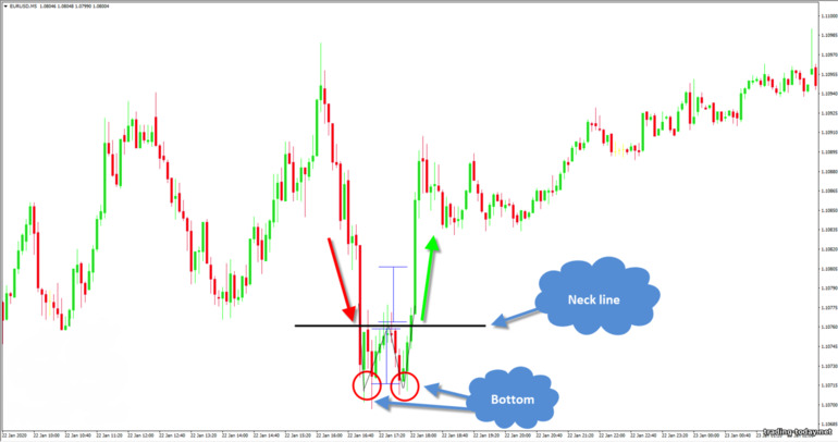
A double bottom is a technical analysis figure that is a mirror image of a “Double Top”. That is, the model indicates the end of a downward trend and the beginning of an uptrend. In this case, the price hits a strong resistance zone, which it cannot break through, and after two (sometimes three - triple bottom) attempts, the trend changes to upward.All other formation conditions are exactly the same as for the “double top”. A double bottom is formed as follows:
- The model will always be at the very bottom of a downward trend (the model does not form in sideways modes)
- Both depressions will be approximately at the same level
- If the second “bottom” is higher than the first, then this is a strong pattern
- The distance from the neckline to the second depression will be approximately equal to the distance that can be expected in an uptrend after the pattern is triggered
- Transactions are opened: 1) immediately after the breakdown of the neck line; 2) after closing a candle that broke through the neckline
- Levels and zones of support and resistance
- Japanese candlestick reversal patterns
- Indicators indicating a possible trend reversal
Head and shoulders – reversal pattern of technical analysis
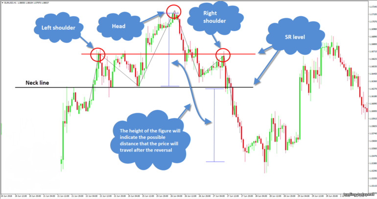
Head and shoulders is a technical analysis pattern that consists of three tops and signifies the end of an uptrend. The pattern is formed at the tops of a bullish trend.If we consider this model of technical analysis in more detail, we get the following:
- The first top (left shoulder) is formed as part of a regular uptrend at the resistance level
- The second top (head) is higher than the first and is formed after the breakdown of the previous resistance level. The price rises until it hits a new resistance level (zone)
- The third peak (right shoulder) is lower than the second, which means the upward trend is over and you should prepare for a price reversal
The head and shoulders pattern literally shows us the transition from an uptrend to a downtrend. A trade is entered when the neck line is broken - the line indicating the lowest point of retracement after the formation of the left or right shoulder begins. Everything here is the same as with the “double top” model - you can open a deal when the level is broken, or you can wait until the breakout candle closes and only then enter the market for sure.
On the price chart, the “Head and Shoulders” technical analysis model will look like this: The height of the Head and Shoulders technical analysis pattern will indicate the distance that the price is likely to travel in a downtrend after the reversal pattern has fully formed.
Reverse head and shoulders - reversal technical analysis model for a downtrend
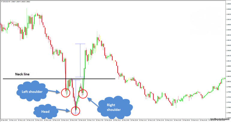
Reverse head and shoulders is a technical analysis model that completely repeats all the features of the head and shoulders pattern, but appears after downtrends and signals the end of a bearish movement and the beginning of a bullish trend. Simply put, this is a mirrored reversal pattern.As in the previous case, “Reverse Head and Shoulders” consists of three depressions:
- Troughs are formed at support and resistance levels
- The first depression (left shoulder) indicates the continuation of the trend
- The “head” or second depression updates the previous low
- The third depression (right shoulder) forms higher than the “head” depression, indicating the end of the downtrend and the beginning of the bullish trend
- The strength of the model depends on the position of the shoulders - models where the right shoulder is formed higher than the left are considered strong
- Transactions are opened upon a breakdown of the “neck” level - the maximum point formed during the formation of the left or right shoulder
Cup with a handle - a trend change pattern in technical chart analysis
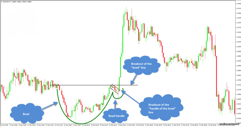
To make charts easier to understand, technical analysis figures are often given funny names. "Bowl with Handle" is one of them. It would seem that what does a bowl with a handle have to do with trade, but, as it turned out, it is the most direct.The figure highlights the section of the chart where the downtrend changes to an uptrend - this is the bowl. The change in trend can be traced by the troughs and peaks - the troughs stop updating, and the peaks, on the contrary, begin to update each other. The first price rollback in an emerging uptrend acts as a handle - confirmation that the downtrend is over and bulls are now ruling the market. The upper “borders” of the bowl are located at the level of support and resistance, but we will be interested only in the left border, because a breakdown of this border will mean the continuation of the trend.
Traders also very often open on a breakout of the “handle” - a price rollback against an upward trend movement. Here the conditions for entry are exactly the same as when trading the “Flag” or “Pennant” patterns - the upper limit of the set rollback channel is broken - we open a trade up. The bottom of the “bowl” can look like a depression or a consolidation (our example). It is important that the uptrend that has begun is visible, during which a pullback has formed - the handle of the bowl.
An inverted bowl with a handle is a pattern of changing an upward trend to a downward trend
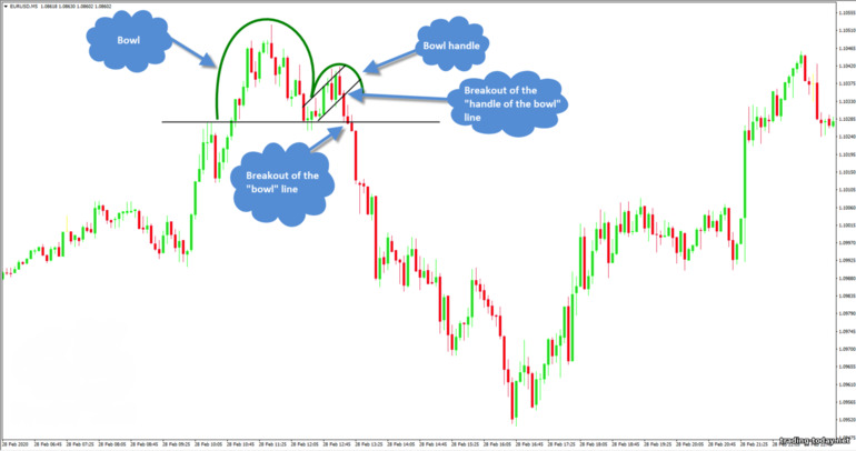
An inverted bowl with a handle is still the same “bowl with a handle”, only formed in an uptrend. The figure indicates the end of the uptrend during the formation of the bowl, and then confirms the reversal with the first pullback against the downtrend - the formation of a handle.As in the usual “Bowl with a Handle” technical analysis model, the edges of the bowl will be at the level of support and resistance, but we will be interested only in the left part of the “bowl” and the handle, which will also be formed on the left.
The trading conditions for this model are similar to the previous one - transactions can be opened when the horizontal line of the “bowl” is broken, and you can also trade “Flag” or “Pennant” during the formation of the “handle”: Here, the change in trend can be seen by the peaks: the updating of the peaks stopped at the “bottom of the bowl”, but the troughs began to be updated - a clear sign of the emergence of a downward trend.
Rectangle - a consolidation (sideways movement) figure in technical analysis
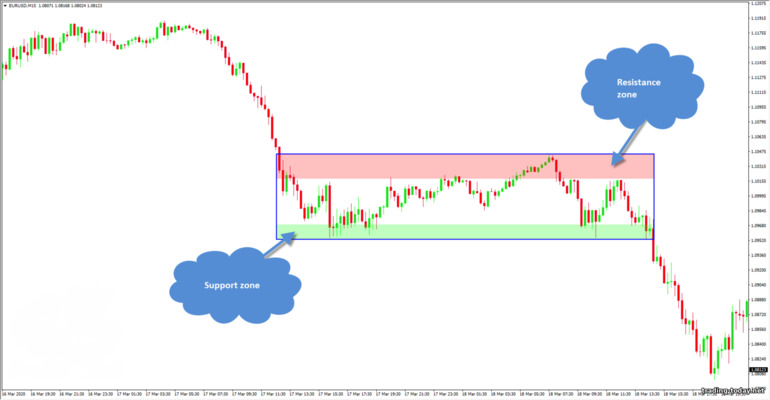
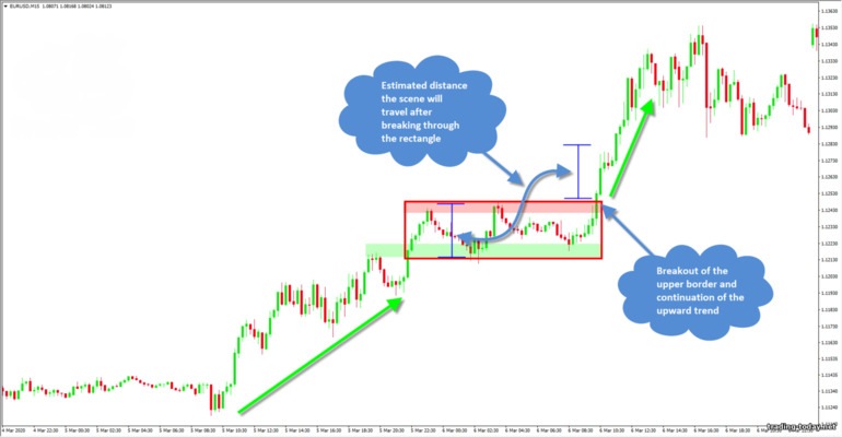
A rectangle is a figure of sideways price movement (consolidation). If a flat pattern has begun to form on the chart, this means that the market has temporarily exhausted itself and needs time to gain new strength.A rectangle does not always indicate the complete end of a trend. On the contrary, having formed in a trend, the rectangle indicates a strong zone of supply and demand, which the price is not able to break through in the near future, but as soon as market participants have enough strength, the trend will continue. The upper and lower boundaries of the rectangle are formed by support and resistance zones (demand and supply zones).
When it comes to using rectangles in trading, there are only three reliable methods:
- Trading on a breakdown of the borders of the rectangle - opening trades with the expectation that the border of the rectangle (sideways price movement) has been broken and the price will continue to move, but as a trend
- Trading on a rebound from the borders of the rectangle - returning the price inside the price channel. This kind of trading is very simple and allows you to earn a stable income while the rectangle is being formed. It is advisable to wait for the moments when the price alternately reaches the upper and lower boundaries of the price channel
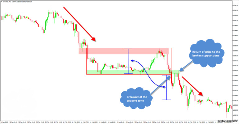
- Trading on a rebound after a breakout of the rectangle - trading as at a regular support and resistance level. We wait for the breakout of the border of the rectangle, after which we wait for the moment when the price returns to the broken border and here we open a deal in the direction of the breakout on more favorable terms. This strategy is very reliable, but the price does not always return to the broken border, so this can lead to wasting time without results
Rectangle pattern in a bullish (upward) trend
If we consider a rectangle in an uptrend, then it is worth paying attention to some points:- The rectangle acts as a “rollback” - with a high probability, this is a temporary phenomenon
- The support zone is stronger - it is from it that you should open trades
- The height of the rectangle is approximately equal to the distance that the price will travel after breaking through the sideways borders
- A breakout of the upper boundary is more likely to occur
Rectangle pattern in a bearish (downward) trend
A rectangle pattern in a downward or bearish trend will also be a trend continuation pattern in most cases.It would be more correct to look for entry points in the bearish rectangle:
- From the resistance zone (from the upper border)
- When the lower border is broken - the support zone is broken
- When the price returns to the broken support zone, enter in the direction of the current trend
Rhombus or diamond - trend continuation figure in technical analysis of charts
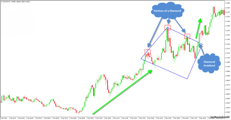
A diamond or diamond forms during complex pullbacks in trending price movements. This figure is a trend continuation model, since after its formation the price movement continues in the same direction as the trend preceding the pattern.The model itself is a rhombus, and if the figure is formed in an upward trend, then only the upper edges of the diamond are important to us, and if the trend was downward, only the lower edges of the diamond are important. Simply put, we need to determine the breakout points - these are our points for entering the trade.
In an uptrend, the top edges of the diamond are determined by the tops. The upper left edge of the diamond is drawn through at least two peaks, and the right edge of the diamond is drawn through the highest (central) and next (right) peak - a breakdown of this particular edge will tell us about the continuation of the trend. The lower edges of the diamond are additional and do not carry any important information, except that they indicate the boundaries of the narrowing channel: If we consider a diamond in a downward trend, then the lower edges line up along the depressions. In a correct diamond, there must be a depression that stands out, indicating a local minimum, and on the right and left there are depressions that formed a little higher. A breakout of the lower left edge shows us the entry point and informs us about the continuation of the trend:
Rising wedge - a technical analysis figure
A rising wedge is a pattern that can often be seen on charts. The figure is a reversal, but also applies to trend continuation patterns - it all depends on where this pattern was formed.A growing wedge is a tapering triangle pointing upward. If a rising wedge forms at the top of a trend, then it is a reversal pattern and we should expect a bearish price movement: If a growing wedge formed during a downward or bearish trend, then such a pattern is a “rollback”, which means we should expect the trend to continue: The boundaries of the rising wedge indicate weakness of the bulls, which means that the lower boundary will soon be broken. The distance of the base of the wedge indicates the likely distance that price will travel after exiting the wedge, so you can always evaluate the situation and decide whether the play is worth the candle or whether you should wait for a better opportunity.
A falling wedge is a trend reversal and continuation pattern
A falling wedge is exactly the same pattern as a rising wedge. It (the figure) can be either a reversal pattern (if it is located in a downward trend) or a trend continuation model (if it was formed in a bullish trend).The width of the base of the falling wedge will indicate the distance that the price will cover after breaking the upper border. Unlike a rising wedge, in a falling wedge we should expect a breakdown of the upper boundary. In a downtrend, a falling wedge looks like this: If we consider a falling wedge in an uptrend, it will be a trend continuation figure:
Triangle pattern in technical analysis of price charts
Triangles in technical analysis are no less popular than “double bottom” or “flag”. Triangles can be both trend continuation patterns and reversal patterns. It all depends on:- Where the triangle formed - in trend or not
- What shape does the triangle have - what is the slope of its faces
In trend movements, triangles very often serve as trend continuation models, indicating areas of the chart where market participants are gaining strength before the next strong push. For example, in an uptrend, the triangle might look like this: In a downtrend, the triangle will look like this: As with the “Flag” model, we will be interested in only the side of the triangle that is directed towards the current trend - a breakdown of this border means the continuation of the trend. The height of the base of the triangle will indicate the minimum distance that the price will travel after exiting the triangle.
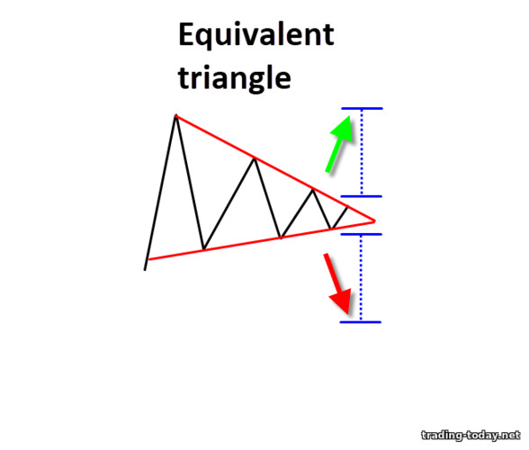
If a symmetrical triangle has formed after a sideways price movement, then it is very difficult to guess where exactly the price will go - a balance has been established in the market between bulls and bears, and the price can go both up and down. In such cases, it is best to just wait - the triangle will gradually compress the price and, sooner or later, it will break through one of the boundaries. In our example, the price went down, breaking through the lower border - the entry point, I think, is obvious:
Ascending triangle - reversal pattern
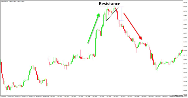
An ascending triangle is a price reversal pattern in an uptrend. This triangle is formed when the price cannot break through any resistance level. The bulls try to break through the level several times, but they fail and the price reverses: Such triangles are immediately noticeable and form only at the tops of trend movements. The width of the triangle at the base indicates the minimum distance that the price will cover when moving down. Here it is worth taking into account the distance from the resistance level - a breakdown of the support line and the appearance of a downward signal may appear slightly lower than a strong level that did not allow the price to rise.Descending triangle – reversal pattern
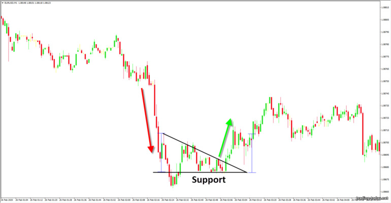
A descending triangle is an inverted “ascending triangle.” The principle is the same - the price has hit a level, but now it is a support level and cannot break through it. Bears make several attempts to pass the support level, but each attempt is weaker than the previous one. As a result, the level remains unbroken, and the price reverses – an upward trend begins. A descending triangle forms at the very bottom of a bearish trend and means it will end soon.It is worth noting that triangles, like any other technical analysis figures, do not provide a 100% guarantee that the model will work as intended. For example, there are cases when, after the appearance of a descending triangle, the price broke through the support level and went down. Such cases are rare, but it is still possible. Always remember that there are no 100% trading strategies and do not forget about the risks that accompany a trader throughout his trading journey!
Three types of technical chart analysis patterns
All figures and models of technical chart analysis can be divided into three types:- Trend continuation models
- Reversal figures
- Uncertainty models or two-sided figures
Trend continuation patterns
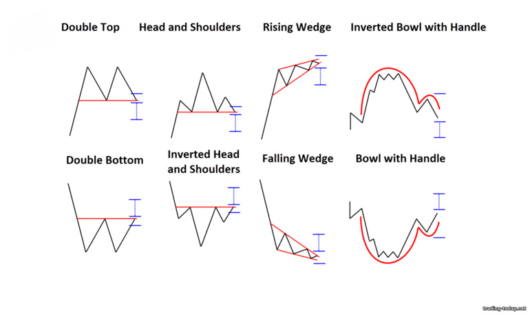
Trend continuation patterns indicate that there is a high probability that the trend will continue. These patterns are also called consolidation patterns, as they are formed during pullbacks in trend movements.Most of the following figures can also be reversals - it all depends on where these figures are formed. Entry is made exclusively after the formation of the figure and only in the direction of the current trend.
Reversal patterns or trend reversal patterns
Reversal patterns include:- Double top
- Double bottom
- Head and shoulders
- Inverted head and shoulders
- Growing wedge
- Falling wedge
- Bowl with handle
- Inverted bowl with handle
Uncertainty figures or double-sided figures
Most often in your practice you will encounter only one double-sided figure - this is an equal triangle. The formation of this figure does not make it clear where exactly the price will go, but a breakdown of any of the boundaries indicates an advantage between bulls and bears, which, in the future, leads to a trend or trend impulse in the direction of the breakdown.Why is it worth studying technical analysis patterns?
It just so happens that all technical analysis is based on the analysis of price charts. Charts are our direct source of information. They tell us about what happened, what is happening now and what will happen next. It is very important to learn to understand market signals - he does not mind telling us absolutely everything. Technical analysis figures are one of the ways to understand the “language” of the chart and use it correctly.The patterns are repeated - they have been tested over the years and by thousands of traders. No matter what trading method you currently use, technical analysis patterns will not only bring something new to your trading, but will also improve your current trading results.








Reviews and comments